We can use Pivot Table to summarize, sort, reorganize, group, count, sum, average, or total the data stored in a table. With it, we can turn columns into rows and rows into columns. You can group by any field (column) and use advanced calculations to group by that field (column). In a spreadsheet, a Pivot Table helps reorganize data to obtain a better report.
If you have never used Pivot Table, here is an example of how to use it. To use Pivot Table in Excel, firstly you have to create a simple table in Microsoft Excel.
Step 1: Create a Table.

Step 2: After adding table column and row data go to Insert Menu -> Pivot Table.
There are two ways you can select the range:
Manually Range Select
If you click anywhere in the document (apart from your created columns and rows), there is no selection in the Create PivotTable window. In that case, to use a Pivot Table, you must select the cell range manually in the given text box.
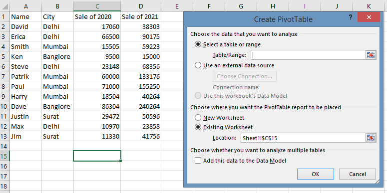
Automatically Range Select
Clicking on the value of a column field automatically selects a range in the Create PivotTable window.
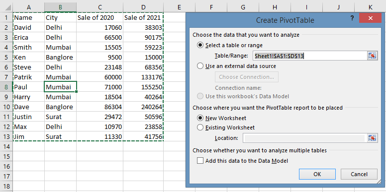
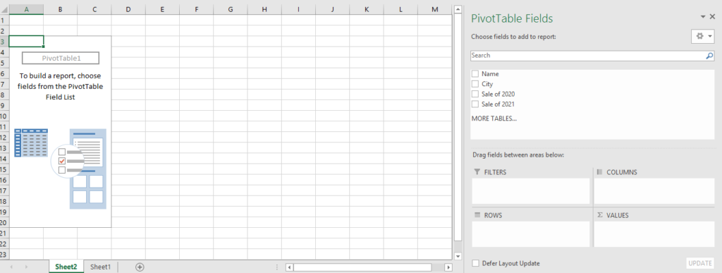
Step 3: Click the Ok button. Below window will appear. This window is Pivot Table Window.
How to use Pivot Table with Examples?
Here are a few examples that explain pivot tables in detail.
Display Single Column
Example 1: Show all the Names in your organization.
To achieve this output, the following are the steps:
Go to the PivotTable Fields window (it is on your right hand side of the screen).
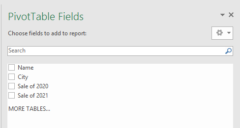
Select or tick mark the Name field.
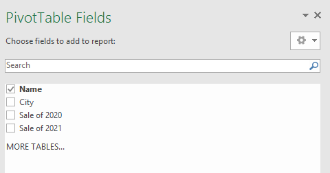
Pivot Table shows the Names of all people (on the left side of the screen).

Key Point:
- A list of all Names appears in ascending order.
- If you wish to display all the City names, just mark the field city (one at a time).
Display Multiple Columns
Example 2: Display multiple columns.
Go to the PivotTable Field window (you’ll find it on your right side of the screen).

Then tick mark or select Name, Sale of 2020, and Sale of 2021.
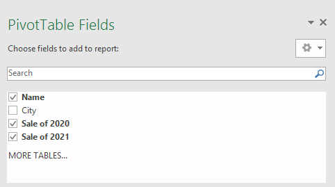
A Pivot Table shows multiple fields (its display is on the left side of the screen).
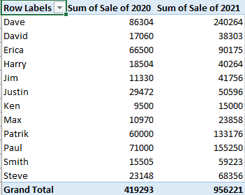
Key Point:
- In the above example, the first Name field is tick, then Sale of 2020, and lastly Sale of 2021. So the order of selection is important.
- By default, Grand Total is generated.
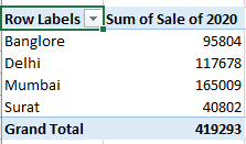
Example 3: In Delhi city, how many sales in 2020?
Go to the PivotTable Field window (it’s on your right side of the screen).

Select the field City and Sale of 2020.
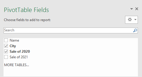
On the left side of the screen are the fields for City and Sale of 2020.
Key Point:
- In the above example, the first City field is tick, then Sale of 2020. So the order of selection is important.
- The Grand Total is generated by default.
Example 4: In which City how many people work?
PivotTable Fields window will appear on your right side of the screen.

Choose or select City and Name field.
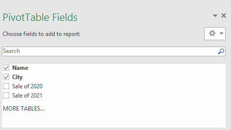
In the Pivot Table, the fields City and Name appear on the left side of the screen.

Key Point:
- In the above example, the first City field is tick, then the Name of the field is tick. So the order of selection is important.
- By default, Grand Total is generated.
Example 5: How many persons work in which city and show each person 2020 sales?
Go to the PivotTable Field window (it’s on the right side of your screen).

Then tick mark or select City, Name, and Sale of 2020.
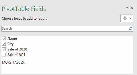
Pivot Table displays the fields City, Name, and Sale of 2020 on the left hand side.

Key Point:
- As shown above, the first selection is City, and next is Name, and the last is Sale of 2020. So it is important to select them in that order.
- By default, Grand Total is generated.
Example 6: Which person works in which city?
Go to the PivotTable field window (it is on the right side of the screen).

Choose or select Name and City.
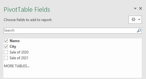
On the left side of the screen, you can see Name and City fields in Pivot Table.

Key Point:
- In the above example, the First Name field is tick, then City is tick. So the order of selection is important.
- By default, Grand Total is generated.
Advantages of Pivot Table
- It is easy to move, add, or delete fields.
- Results are automatically recalculated whenever fields are added or dropped, whenever categories are hidden or displayed.
- When the original worksheet data changes, it can be refreshed.
- It sums up a large amount of data into a small amount of space.
- Presents information in a more organized manner.
- It offers interactive data analysis.
- You can combine data from several sheets.
- In the pivot table, you can create a chart of summarized data.